
In the previous post, we saw how to import GPX data coming from a Mobile Sports Application, such as Runtastic, and how to create a map. In this post, we go a step further by creating a map which is interesting for runner who wants to analyse their performance. Having several series of maps, the sporty people can analyze themselves and check the portions where they perform well and where less. Notice that this is feature available in the PRO version of Runtastic, for example.
Stop writing! Check out the following self-explanatory map!
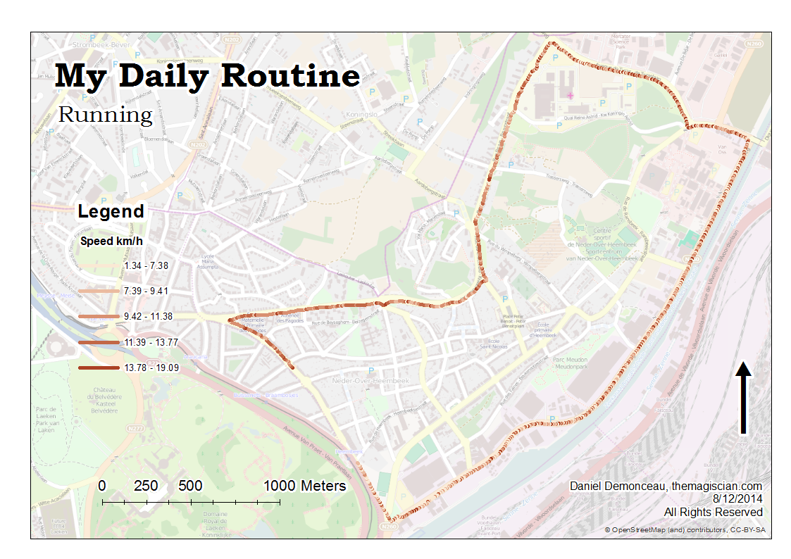
As you can seen, I start pretty well before seeing my speed decreasing (due to a steep slope). The speed is then higher because of running down and then the speed decreases slighty along the channel.
How to build this map?
GRAB the Python script HERE!
Building this map seems easier than it really is! Here is the complete workflow , which is translated in Python:
- Use the gpx to features (conversion) tool – output feature layer gpx_points
- Use the Sort (Data Management) tool to sort the rows according to their recording time – output feature layer gpx_points_sorted
- Loop through all the rows and stored the recording time, the longitude, latitude and the elevation into arrays (these values will be transferred into a new Feature Class)
- Create Feature Class (Data Management) and name it gpx_segments – This will be the layer that will contain the segments constructed between each point
- Use add field (data management) to add the following fields to the gpx_segment layer: lengthm (length in meter for the segments), recordTime, elevation, and speed
- A SearchCursor is used on the gpx_points_sorted, and each of the array stored values are put into the gpx_segments layer.
- The longitude and latitude of two consecutive points are used as segment geometry input
- A trigonometric formula is used to calculate the distance between each point by knowing the longitude and latitude of the point (pay attention that lon/lat have to converted into radians for the python math function)
- This distance and the time gap between two recordings are used to determine the speed for each segment.
- Make Feature Layer (Data Management) – output file gpx.lyr
- Save To Layer File (Data Management) – output file gpx.lyr
- Apply Symbology From Layer (Data Management), which reference symbology layer has to be provided (please find mine HERE)
- Package Layer (Data Management) – output file gpx.lpk
- Go into the layout to finish the map (add a title, legend, scale bar, etc.)
- Export it into png
To make use of the script, change only the four variables at the beginning of the script, and which are:
- gpxRAWdata: the absolute path to the gpx data
- workinggdb: gdb used for storing temporary Feature Layers
- outputfolder: folder which will contain the output lpk file
- symbology_layer: the layer symbology that will be used for your data (please find mine HERE)
Second example
Here’s a second example of a speed map (you will recongnize the track from my previous articles)
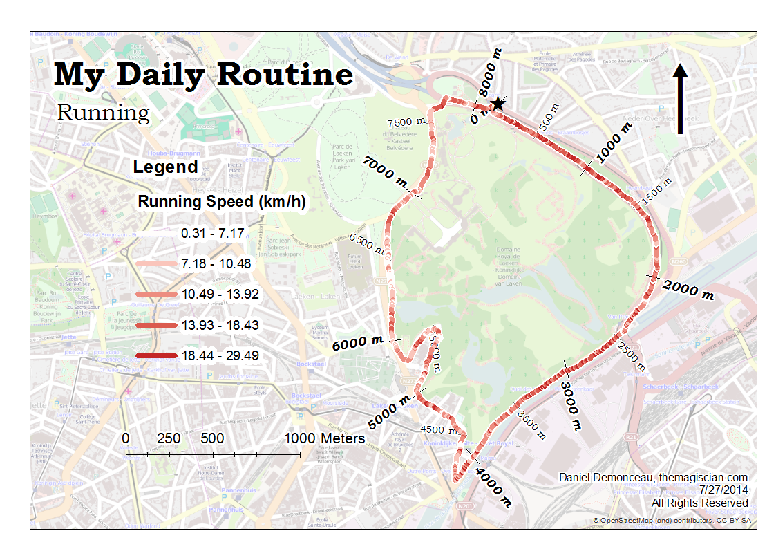
I am much more faster in the first kilometers than in the lasts. This is also due to slope of the course which is going down from kilometer 0 to kilometer 4 before going up from kilometer 6 to the rest of the foot race. There are also two white spot between km 2 and km 2.5: these corresponds to traffic lights and hence a complete stop.
Note that some speeds are exaggerated and some underestimated. Keep in mind I am using my phone’s GPS and that precision is compromised by the trees are along the way!