
Even if the FIFA World Cup 2014 is finished since a week, I still did a new Web App about it ! (it is the last of the series for long time, I promise).
I call it the World Cup Goals Map Theater and it shows Cartograms, 2 for each World Cup, where the size of the countries are proportional to the number of scored and conceded goals per event. As a picture is worth a thousand words, I invite you to discover the Theater immediately! (Here under in the standalone webapp).
How To Build The World Cup Goals Map Theater ?
The Data
Attributes
These are the number of scored and conceded goals per country participating at each World Cup. Wikipedia is a very useful and exhaustive source of information… So it is for finding our needed information!
Each World Cup is described with precision on a dedicated page and all the pages related to the World Cups slightly follows the same structure. The stats of each team during the tournament are detailed at the bottom of each the page. See here the example of the information about the team at World Cup 1930 in Uruguay:
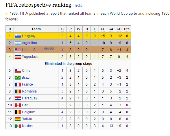
Just Copy the information and paste it into a text editor such as notepad++. As only the goals matters for our application, delete all unnecessary information and just keep the Team’s name, GF and GA. Be sure to keep the headers and to separate each data by a tab. Save the file a csv.
This operation has to be done for all the 20 World Cups, … Enjoy!
Geometries
We’re doing a map so the principal data we need are … the geometries of the countries of course. You can find a lot of free world shapefiles all over the internet you could use but that would be too easy for a professional webapp right ?
Right! The complexity in such kind of series of events driving through time is that in geography, like in everything, nothing is static. Right ? So it is for our countries too! Just look at the previous screenshot in the table. We see a country known as Yugoslavia … That’s not okay for our super shapefile we found previously because this country does not exists anymore! So our Shapefile has to be “reshaped” for each World Cup and this is a really tough job!
Another issue is with nations participating in World Cups such as England, Scotland, Wales and Northern Ireland which all belong to the UK.
I made 4 versions of the original Shapefile I found and which represents now non-existing countries
- 1930 – 1938
- Yugoslavia (merge of Serbia, Montenegro, Kosovo, Bosnia and Herzegovina and Croatia)
- Soviet Union (merge of all the satellite states)
- Czechoslovakia (merge of the Czech Republic and Slovakia) – Please forgive for this simple assimilation, the territory was a bit larger than that (because of extending to the now Ukraine) but this would have meant to search for older archives and more work…
- Germany and Poland – I kept the current borders, which is not correct! Germany extended far more in the East where now Poland stands. But as previously said, that would have meant extra work and as the map will be hugely distorted, the country borders does not need military precisions
- 1950 – 1990
- Germany has been split in two parts: West and East Germany
- 1994 – 1998
- The Soviet Union dismantle into numerous new states
- Yugoslavia split gave birth to Croatia and Bosnia and Herzegovina but Serbia and Montenegro still plays under the “Yugoslavia” banner
- Germany is reunified
- Since 2002
- Team Yugoslavia became Serbia
All these reshapes and name changes has been made by hand by overlaying a reference layer (ArcGIS Street Basemap). To be clear: I did a dirty job by not digitizing the former borders exactly. We are doing a cartogram so precision is not the main key (even if it is an evil sin to do so as a geospatial engineer).
The Maps/Cartograms
Great! We have our data! Let’s make the maps.
I did use ArcGIS for desktop but there are for sure other software you can use to make cartograms. Here are the steps:
- Import the World Shapefile
- Import the data
- Perform a join between the geometries and the tabular data (key: Team’s name)
- Be sure that the Team’s name are the same both sides. Pay attention to “and” which can be “&”, or countries such as “Ivory Coast” which are also sometimes depicted as “Côte d’Ivoire” (keep this advice for later as this team did not participated in any of the first World Cups). Etc.
- Of course, data (geometries and attributes) for the time period 1930 – 1938 has to joined together, 1950 – 1990, 1994 – 1998, 2002 – …
- If the joined table contains NULL values for scored/conceded goals, that is, for sure, the case for countries that never took part in any tournament, put there a ‘0’ (zero) as value. Otherwise, the ArcGIS Cartogram Plugin does not work (see below)
- Use the cartogram making plugin, which can be download here.
- For each year, launch this tool twice: one for scored goals and the other for conceded goals
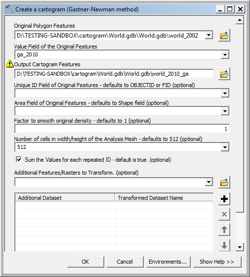
- As the output cartogram only contains the original ObjectIds and the field on which the cartogram has been created, scored or conceded goals, it has to be joined back to the original table to get the attributes (the Team’s name)
- Create a style for the Cartogram
- The Graduated Colors seemed to be the best option
- I did use a green color ramp for scored goals and a red color ramp for conceded goals
- (Do the styling only two times (for scored and conceded goals) and then copy/paste it for all the other 19 tournaments)
- Label the map
- The countries can be very unrecognizable, because of sometimes VERY distorted shapes
- I choose to label the countries this way: [COUNTRY_NAME] + [NUMBER_OF_GOALS]
- Label only countries which took effectively part in the tournament – Specify a filter to label only countries with conceded goals > 0 (as no country at all in history were goal-conceded-free)
- (Do the labeling also only two times (for scored and conceded goals) and then copy/paste it for all the other 19 tournaments)
- The final step is the layout of the Map. Choose a round scale factor (1/200 000 000 for A4), center the map and add
- A nice title: Goals Scored/Conceded
- Subtitle: World Cup xxxx
- A legend
- The credits
- (Layout has to be done only once as it is reused for all the other maps)
- Export your nice map Et voilà! You have your Cartograms! Now do it 39 other times (remember 2 per World Cup)
Honestly, it took me a large amount of time creating all these cartograms. You have to take attention to every detail:
- Preparing the data – Conversion from the data taken from Wikipedia to csv
- Shaping the geometries for split/regrouped countries through the years
- Rename the shapes according to the country names changes in time
- The names of the countries have to be same in the geometry table and the attributes as they are used for joining the tables
The Webapp – The Theater
We now have all our maps that we want to expose. I had this idea of using a kind of slider to drive from a map to another. A simple slide show would have been to simple so I decided to start my research over the internet. I found an interesting tool which is the AnythingSlider.
- Download the ZIP package and extract it somewhere on the disk
- Open the sample index.html file in a text editor
- Copy the part in the file which is about the slides and replicate the tags as many times as you have maps to show (40)
- <li class=”panel1″><img src=”http://maps.themagiscian.com/worldcups/ga_1938.png” alt=””></li>
- <li class=”panel1″><img src=”http://maps.themagiscian.com/worldcups/gf_1950.png” alt=””></li>
- <li class=”panel1″><img src=”http://maps.themagiscian.com/worldcups/ga_1950.png” alt=””></li>
- …
- Adjust the parameters of the AnythingSlider template
- Add a clickable link to add a comment and the logo of themagiscian.com
- Upload the whole thing and it is done 🙂
Don’t hesitate to leave a comment or to contact me if you need clarifications, if you have questions, … or if you want to criticize or compliment the work 🙂