
The European Commission’s Copernicus programme makes it possible to have a snapshot of Earth every 5 days in the multispectral bands. I already covered several applications of Sentinel-2 imageries:
- Full Sentinel-2 cloud-free mosaic of Belgium!
- Agriculture and Sentinel-2: an unsupervised temporal classification
- Change detection using Sentinel-2 and PostGIS
- Earthquake in Amatrice, Italy: Before/After with Sentinel-2
A zillion of information can be gathered out of every single scene. It does not, however, tell us where these things we’re seeing are coming from, and where they are going to. To do this, we need several scenes of the same area but taken at different moment. Or, in other word, we need to use time series to follow the evolution of an area.
Our study area is the Northen part of Liege in Belgium. We’ve taken several Sentinel-2 scenes between the period going from the 1st of May 2016 and the 25th of September 2016. The evolution of the agricultural fields provides a lot of information, going from the first moments of growth, to maturity and harvest. Notice the data were collected using the method already described here.
The first animated gif file is in true color. This series of scenes is very valuable when used with an agricultural calendar. One could guess of which crop type the fields are knowing the time of harvest period.
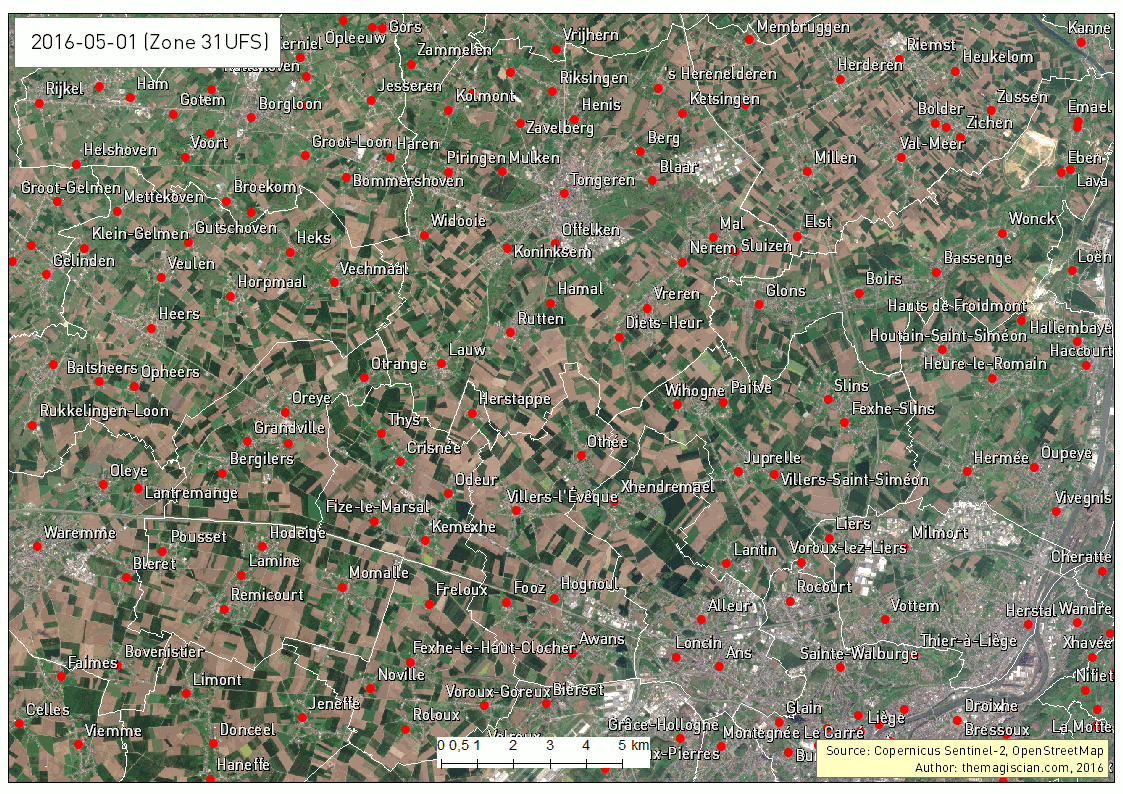
As summer peak approaches, we see the overall vegetation become greener. The first harvest wave occurs in the month of June. The first bare lands are most probably hay fields. July sees the biggest harvest season with wheat, sugar beets, peas, etc. Corn is harvested during the September month and the last green fields can be of maize. For the full explanations, please see following article: http://www.quadratic.be/en/le-suivi-de-levolution-des-cultures-en-utilisant-les-imageries-satellitaires/ .
Another intersting time series is about the band combination 5, 4 and 3. It corresponds to the NIR-R-G band combination. This indicator is often used to characterize plants’ health.
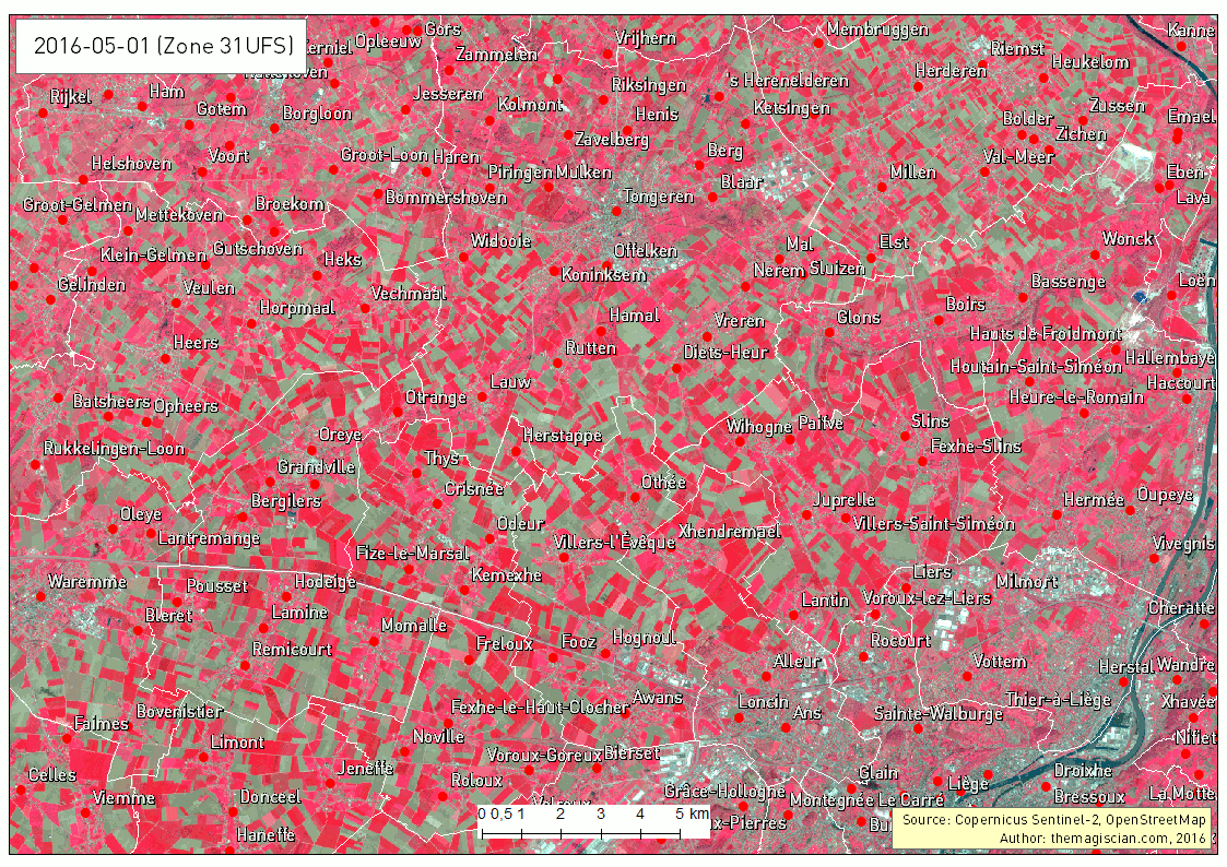
Bright red corresponds to healthy vegetation while the more pinkish areas shows some less active plants. Bare land appears clear blue and water very dark as it absorbs almost every wavelength.
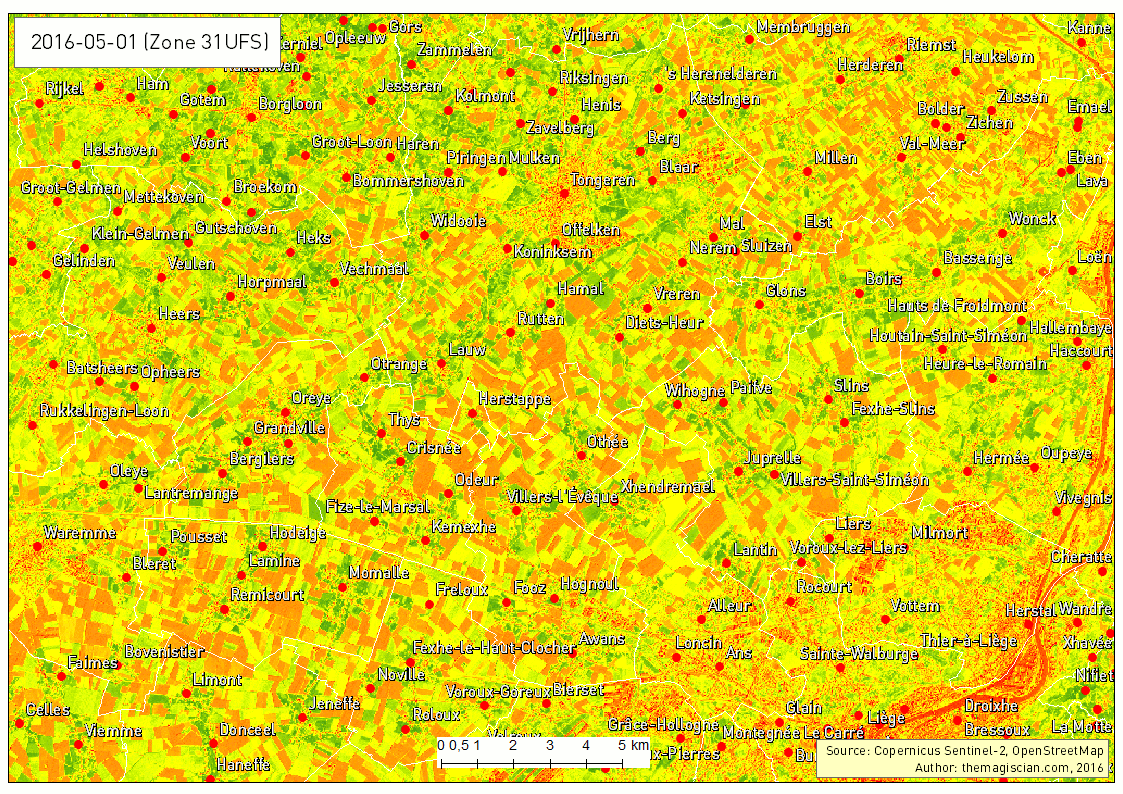
The last example of times series that can give additional information is showing the evolution of the Normalized Difference Vegetation Index (NDVI). This index characterizes the photosynthetical activity. The greener the field hereunder, the more active it is. This index is not to be confused with the biomass productivity of a field.
The Time Series is very intersting way to analyse what happens on Earth. The frequent revisit of the Sentinel-2 satellite makes it possible, in theory, to add a new scene to the time series every 5 days. Our example is about agriculture and can be applied to a vast majority of domains! The best example was our change detection articles:
- Change detection using Sentinel-2 and PostGIS
- Earthquake in Amatrice, Italy: Before/After with Sentinel-2
If you’re more interested in Sentinel-2 and agriculture, do no hesitate to follow the company Quadratic.
Cheers,
Daniel